How to Use Tall-Man Lettering to Reduce Medication Name Mix-Ups
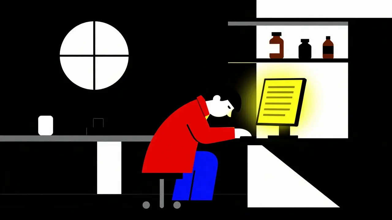
Imagine you are a pharmacist working the night shift. You are tired, it is busy, and you have one more prescription to fill. The screen says "prednisone." Your hand reaches for the bottle. But wait-what if the doctor meant prednisolone? These two drugs sound almost identical and look nearly the same on a list. One treats inflammation; the other has different metabolic effects. A mix-up here could hurt a patient. This is not just a hypothetical nightmare. It happens every day in hospitals and pharmacies around the world.
The good news is that we have a simple, low-cost tool to stop these mistakes before they happen. It is called Tall-Man Lettering. Tall-Man Lettering is a typographic technique that uses selective capitalization within drug names to differentiate look-alike, sound-alike (LASA) medications and prevent medication errors. By changing how certain letters appear in a drug name, we create a visual barrier that forces our eyes to slow down and notice the difference. Let's break down exactly how this works, why it matters, and how you can use it effectively in your practice.
What Exactly Is Tall-Man Lettering?
You might have seen it without realizing it. Instead of writing "hydrocodone" and "hydromorphone" in all lowercase, you see them written as HYDROcodone and hydroMORPHONE. See the difference? The capitalized letters highlight the part of the word that makes the drugs distinct from each other.
This method was coined by the Institute for Safe Medication Practices (ISMP) back in 1999. They noticed that standard fonts made similar drug names blend together. Our brains are wired to read words quickly, often skipping over small details. When two drug names share many letters, our brain glosses over the differences. Tall-Man Lettering disrupts this automatic reading process. It acts like a visual speed bump, forcing you to pay attention to the specific characters that matter.
The goal is straightforward: reduce the roughly one medication error per 1,000 orders that stems from drug name confusion. It does not replace careful checking, but it adds a layer of defense that catches slips when human focus wavers.
Why Do We Need It for LASA Drugs?
LASA stands for Look-Alike, Sound-Alike. These are the troublemakers in any pharmacy inventory. Think about "carbamazepine" and "oxcarbazepine." Or "zinc sulfate" and "zinc oxide." On a shelf, they sit next to each other. In an electronic system, they appear in alphabetical lists right beside one another. If you are rushing, it is easy to click the wrong one or grab the wrong bottle.
The U.S. Food and Drug Administration (FDA) launched its Name Differentiation Project in 2001 to tackle this. They realized that renaming drugs entirely is impossible once they are on the market. So, they turned to formatting. The FDA's current list includes 72 specific drug pairs that require differentiation. Meanwhile, the ISMP maintains a much larger list with 252 pairs, updated quarterly to keep up with new reports of confusion.
Here is the key rule: you must capitalize the dissimilar letters starting from the left side of the name whenever possible. For example:
- VinBLAStine vs. vinCRIStine
- CISplatin vs. CARBOplatin
- PredniSONE vs. predniSOLONE
Notice how the capital letters jump out? That is the point. You are not just making text bold; you are highlighting the unique identifier of each drug.
How to Implement Tall-Man Lettering Correctly
Using Tall-Man Lettering is not just about picking random letters to capitalize. If you do it inconsistently, you create more confusion than you solve. Here is how to get it right in your healthcare setting.
- Choose the Right List: Decide whether you will follow the FDA, ISMP, or your local health authority's guidelines. In Australia, they use the National Mixed-Case Lettering List. In the UK, NHS England provides specific guidance. Pick one and stick to it across your entire organization.
- Apply It Everywhere: This is where most people fail. You cannot use Tall-Man Lettering in your computerized order entry system but ignore it on the printed prescription label. It must be consistent across Electronic Health Records (EHRs), automated dispensing cabinets (like Pyxis), pharmacy management software, and even handwritten notes if possible.
- Check Font Compatibility: Not all fonts display uppercase and lowercase letters distinctly enough. Ensure your IT team selects a font where the height difference between "A" and "a" is clear. Sans-serif fonts often work best for readability on screens.
- Train Your Staff: Tell your team why the letters are capitalized. Explain that it is a safety feature, not a stylistic choice. When nurses and pharmacists understand the purpose, they start relying on those visual cues instinctively.
A study published in *Pharmacology Research & Perspectives* in 2022 showed that implementing this across 13 information systems in a hospital took about 16 weeks. It requires coordination between IT, pharmacy, and clinical staff. But the payoff is worth it. One hospital reported a 42% reduction in overridden alerts for LASA drugs after proper implementation.
The Pros and Cons: Is It Really Effective?
Like any safety tool, Tall-Man Lettering is not perfect. It is important to know both sides of the story so you can use it wisely.
| Advantage | Limitation |
|---|---|
| Low Cost: Implementation costs average AU$1,200 per hospital system, mostly for IT updates. | Inconsistency Risks: If different departments use different capitalization patterns, it causes confusion. |
| Visual Speed Bump: Reduces selection errors by 35% in simulated scenarios (ISMP eye-tracking study). | False Security: Some experts argue it creates a false sense of safety without deeper system changes. |
| Easy Integration: Works with existing EHRs like Epic and Cerner without major hardware changes. | Sound-Alike Gaps: Does not help if drugs sound alike but are spelled very differently (e.g., metoprolol vs. methyldopa). |
| High Adoption: Used by 89% of U.S. hospitals and widely adopted in Australia and New Zealand. | Mixed Evidence: Some large studies show no statistically significant drop in actual patient harm, only in near-misses. |
Dr. Michael Cohen, President of ISMP, puts it well: "Tall-man lettering is not a panacea but represents one essential layer in our defense-in-depth approach to medication safety." He means it should not be the only thing you rely on. You still need barcode scanning, independent double-checks, and alert fatigue management. But as a visual aid, it is hard to beat.
Real-World Challenges and How to Overcome Them
I have spoken with pharmacists who love Tall-Man Lettering and others who find it frustrating. Why the split? Usually, it comes down to execution.
One common complaint is inconsistent application. Imagine a nurse using a Cerner system that shows PARoxetine, while the automated dispensing cabinet shows FLUoxetine, and the community pharmacy label uses a different pattern entirely. This inconsistency breaks the mental model. To fix this, organizations must collaborate. Share your Tall-Man Lettering list with partner pharmacies and hospitals. Standardize across vendors.
Another issue is font size. Physician John Davies noted that in some EHRs, the tall letters aren't prominent enough because the font is too small. Make sure your IT department configures the display settings so the capitalized sections are clearly visible on monitors and handheld devices.
Legacy systems also pose a problem. Older pharmacy software might not support mixed-case formatting properly. Sixty-eight percent of hospitals report compatibility issues with legacy systems. The solution is often a middleware update or a phased rollout where critical LASA pairs are prioritized first.
The Future: AI and Beyond
We are standing on the edge of a new era in medication safety. The FDA and ISMP announced a joint initiative in early 2023 to harmonize their Tall-Man Lettering recommendations. This means fewer conflicting lists and more uniformity across the industry. You can expect a unified list soon.
Technology is also evolving. Epic Systems piloted an AI-enhanced Tall-Man Lettering system in 15 hospitals. This system dynamically adjusts capitalization based on real-time error data. If a hospital sees frequent mix-ups between two specific drugs, the AI highlights those letters more prominently for that facility. Preliminary results showed a 29% greater reduction in selection errors compared to static implementations.
Will Tall-Man Lettering disappear? Probably not. Even as voice recognition and barcode scanning become universal, human error remains a factor. As long as humans read drug names, visual safeguards like Tall-Man Lettering will serve as a critical backup. The Agency for Healthcare Research and Quality (AHRQ) projects that this practice will remain standard through 2030.
Practical Steps for Your Team Today
If you want to improve safety in your pharmacy or clinic, start now. You do not need to overhaul your entire system overnight.
- Audit Your Current Lists: Pull up your top 20 LASA drugs. Are they formatted correctly? Do they match the ISMP or FDA guidelines?
- Engage IT: Ask your IT team to check font rendering on all screens. Ensure uppercase letters are distinct.
- Educate Staff: Hold a brief meeting. Show examples of correct vs. incorrect Tall-Man Lettering. Explain the "why" behind it.
- Monitor Errors: Track near-misses involving LASA drugs. See if proper formatting reduces these incidents over six months.
- Collaborate: Share your formatting standards with nearby clinics and pharmacies to ensure consistency for patients moving between care settings.
Small changes can save lives. By paying attention to how we write drug names, we build a safer environment for everyone involved.
What is the difference between FDA and ISMP Tall-Man Lettering lists?
The FDA list contains 72 drug pairs and focuses on established recommendations, while the ISMP list is larger with 252 pairs and is updated quarterly based on real-world error reports. The FDA often recommends capitalizing from the left, whereas ISMP may suggest different patterns for specific pairs. Organizations should choose one list and apply it consistently to avoid confusion.
Does Tall-Man Lettering work for sound-alike drugs?
It works best for look-alike drugs where the spelling is similar but differs in key letters. For sound-alike drugs with very different spellings (like metoprolol and methyldopa), Tall-Man Lettering has limited effectiveness because there are few similar letters to capitalize. It is most effective when combined with other strategies like barcode scanning.
How much does it cost to implement Tall-Man Lettering?
Implementation costs are relatively low. In Australia, the average cost was reported as AU$1,200 per hospital system. In the U.S., costs vary based on IT resources required for updating EHRs and dispensing systems, but it is generally considered a low-cost intervention compared to other safety technologies. The main investment is time for coordination and training.
Should I use Tall-Man Lettering in handwritten prescriptions?
While primarily designed for digital systems, using Tall-Man Lettering in handwriting can reinforce the habit. However, legibility is paramount. If writing in mixed case makes the script harder to read, prioritize clarity. Digital systems are the primary target for this safety measure due to the risk of misinterpretation in handwriting.
Is Tall-Man Lettering mandatory?
It is not federally mandated in the U.S., but The Joint Commission's National Patient Safety Goal NPSG.01.01.01 requires organizations to differentiate look-alike drug names. Many healthcare accreditation bodies and safety organizations strongly recommend it. In some regions, following national guidelines (like Australia's National Mixed-Case Lettering List) is expected for compliance with safety standards.
David Rangkhal
May 11, 2026 AT 12:38hey guys just wanted to say this is super helpful info 🙌 i work in a small clinic and we definitely need to look into this more. thanks for sharing the details about the different lists it really clears up some confusion i had before 👍
Brian LeClercq
May 11, 2026 AT 21:00The notion that capitalizing letters constitutes a robust safety mechanism is nothing short of absurd. It is a band-aid solution applied to a systemic failure of competence and oversight. We are spending millions on electronic health records, yet we rely on typographic gimmicks to prevent errors that should be caught by basic clinical judgment or barcode verification. This is not innovation; it is negligence disguised as diligence. The FDA's involvement here suggests a regulatory body that has lost its way, prioritizing cosmetic changes over substantive reform. One might argue that if you cannot distinguish between prednisone and prednisolone without visual aids, you have no business handling prescriptions at all. The reliance on such superficial measures erodes professional standards and fosters a culture of dependency rather than accountability. It is a disgraceful approach to patient safety.
Frances Kendall
May 12, 2026 AT 19:46I think Brian is being a bit harsh but I see where he is coming from regarding the limits of this tool. As someone who works in pharmacy informatics, I can tell you that Tall-Man Lettering is just one layer of defense-in-depth. It’s not meant to replace double-checks or barcodes, but to catch those split-second visual slips when fatigue sets in. The ISMP data shows a real reduction in near-misses, which matters because near-misses often precede actual harm. It’s about creating a cognitive pause. When you see HYDROcodone vs hydroMORPHONE, your brain processes them as distinct entities rather than similar strings. It’s a simple, low-cost intervention that leverages how human vision works. We shouldn’t dismiss it because it isn’t a silver bullet. Safety is cumulative.
Sarah Kwiatkowski
May 14, 2026 AT 00:05This is such an important topic! I was so happy to read this article because it gives practical steps we can take right now. I love how it breaks down the pros and cons honestly. It makes me feel more confident about pushing for these changes in my workplace. Thank you for writing this clearly and encouragingly! 💖
Natali Brown
May 15, 2026 AT 15:54I completely agree with Sarah that this is a vital piece of information for anyone working in healthcare settings today. I have been working as a nurse for over fifteen years and I can personally attest to the fact that fatigue during night shifts can lead to incredibly dangerous mistakes even when you are trying your absolute best to stay focused. The idea of using Tall-Man Lettering as a visual speed bump is brilliant because it does not require any additional training time or expensive software updates in most cases. It is just about changing the way we display the text on our screens and labels. I have seen situations where pharmacists grabbed the wrong bottle simply because the names looked too similar at a glance and having those capitalized letters really helps to break that pattern recognition error. It is amazing how something so small can make such a huge difference in patient safety outcomes overall. We really need to advocate for this in our hospitals more often because it is such a low cost high reward intervention that saves lives every single day without fail.
Kelsey Thomas
May 15, 2026 AT 20:43Love this perspective! 🌟 It’s all about creating a safer environment for everyone involved. I’ve noticed that when teams collaborate on standardizing these lists, the stress levels go down significantly because everyone knows what to expect. Let’s keep supporting each other in making these small but meaningful changes! ✨
swetha r
May 17, 2026 AT 17:21oh but wait... do they really want us to believe that capitalizing letters will stop the big pharma companies from causing harm? i mean come on. this is just another way to distract us from the real issues like profit-driven decisions and lack of transparency. why are we focusing on font styles when there are bigger fish to fry? it feels like a conspiracy to keep us busy with trivial matters while they continue their agenda. 😒
Derick Garcia
May 18, 2026 AT 10:12The implementation of Tall-Man Lettering represents a fundamental abdication of responsibility by healthcare providers who ought to possess the requisite intellectual capacity to differentiate between pharmaceutical agents without recourse to such pedestrian typographic aids. It is indicative of a broader societal decline wherein mediocrity is celebrated and rigorous standards are discarded in favor of convenience. The assertion that this method reduces errors is statistically insignificant when compared to the volume of errors caused by systemic incompetence. Furthermore, the reliance on visual cues ignores the auditory component of medication administration, thereby failing to address the full spectrum of potential errors. This is not a solution; it is a symptom of a broken system that requires complete overhaul rather than superficial patching. One must question the integrity of institutions that endorse such simplistic measures as adequate safeguards against catastrophic failure.
Sarah O'Donnell
May 19, 2026 AT 04:15omg yes this is so true!! i cant believe people still argue against this lol. its literally saving lives and its free basically. why would you not use it?? 🤷♀️ #medsafety #pharmacylife